TL;DR for operators
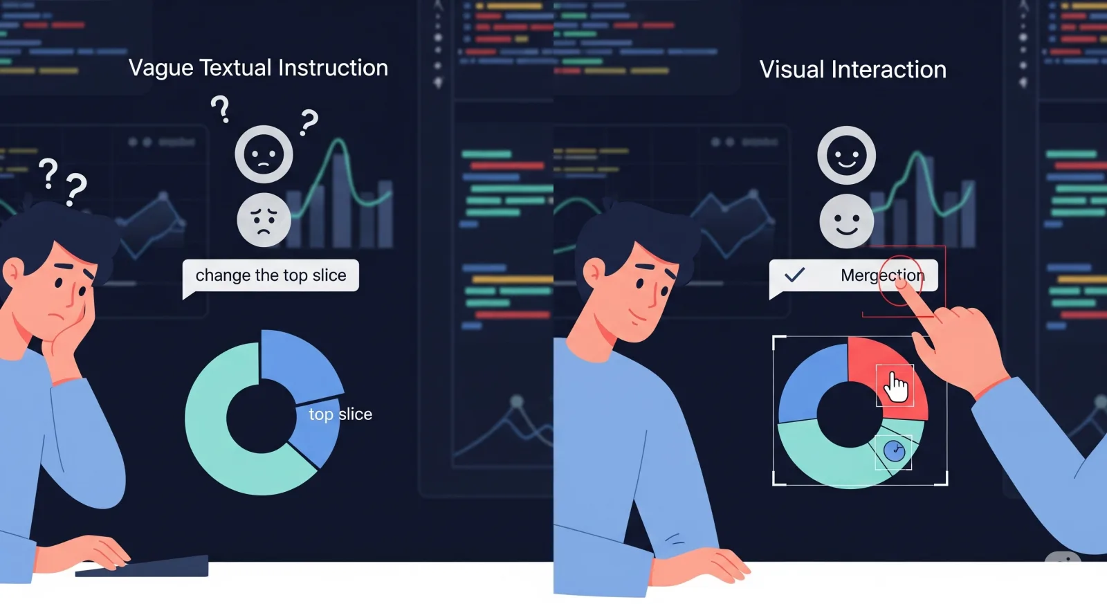
ChartM3 is useful because it reframes chart editing as a four-step control problem: identify the visual target, connect that target to code, apply the edit, and avoid damaging everything else. That sounds obvious until one watches a multimodal model obediently edit the wrong pie slice with great confidence. A familiar little tragedy, now with bounding boxes.
The paper introduces a benchmark where models receive a chart image, its source code, and either a detailed textual reference or a visual indicator such as a bounding box around the target element. The task is not to redraw the chart as pixels. The task is to generate corrected chart code that produces the intended edited chart.1
The operational finding is blunt: adding visual indicators reduces ambiguity for users, but it does not automatically solve the problem for models. In zero-shot tests, GPT-4o leads the evaluated systems, yet it still performs worse under visual-indicator guidance than under textual-description guidance. Its ΔSSIM drops from 56.54 in the textual setting to 38.08 in the visual setting, and its directive compliance drops from 76.80 to 63.36. The model can see, yes. The harder question is whether it knows which code object corresponds to what it sees.
Fine-tuning changes the picture. A Qwen2-VL model trained on ChartM3-Train improves from 12.59 to 63.23 ΔSSIM in textual editing and from 6.5 to 57.88 in visual editing, surpassing GPT-4o on some reported metrics. The lesson is not that every company should fine-tune Qwen tomorrow before lunch. The lesson is that chart-editing agents need domain-specific multimodal supervision, especially if the product promise is “click the thing and tell the AI what to do.”
For business teams, ChartM3 is most relevant to BI dashboards, automated reporting, slide-generation tools, analyst copilots, and internal data products where users want direct manipulation without hunting through chart settings. The practical boundary is equally clear: the benchmark assumes access to chart source code, focuses on Matplotlib, and uses fairly explicit parameter-level edits. It is a serious step toward interactive analytics agents, not proof that models can repair every cursed executive dashboard produced since 2014.
The chart is not the image; the chart is the contract
A dashboard chart looks visual, but it behaves more like a contract between data, encoding, layout, and code. A bar is not merely a rectangle. It is a representation of a variable, a value, a grouping, a colour choice, an axis position, and usually some code object sitting underneath all of that. Editing it safely means respecting that structure.
That is why chart editing is a different problem from ordinary image editing. In natural-image editing, a system can often get away with changing pixels in a plausible way. If a background is softened or a shirt colour changes slightly, the output may still be acceptable. Charts are less forgiving. If the wrong line is recoloured, the chart now lies. If an axis label shifts but the data encoding does not, the visual may become misleading. If a legend entry changes while the plotted series does not, the output is not “creative”; it is broken.
ChartM3 builds its benchmark around this distinction. The model receives the chart image and the corresponding chart code. It must output modified code, not merely a modified bitmap. This matters because code-grounded editing gives the system a way to preserve the chart’s internal logic. A proper edit changes the relevant parameter, object, or plotting call, then leaves unrelated elements alone.
The paper’s core mechanism can be reduced to four operations:
| Operation | What the model must do | Why it is hard in charts |
|---|---|---|
| Target localisation | Work out which visual element the user means | Textual references can be ambiguous; visual indicators require precise region understanding |
| Visual-to-code binding | Connect the visible element to the source code that generated it | The visual object may be produced by loops, arrays, labels, or library calls |
| Controlled modification | Change the right code in the right way | A valid edit must alter the intended property, not merely produce runnable code |
| Non-target preservation | Keep everything else unchanged | Small unintended changes can corrupt chart meaning |
This is the part of the problem that business buyers tend to under-specify. They ask for “AI chart editing” as though the interface is the innovation. The interface is only the opening move. The actual product quality lives in the binding layer between what the user points at and what the software must change.
Pointing reduces ambiguity, but creates a grounding problem
The obvious appeal of ChartM3 is its use of visual indicators. Instead of asking a model to infer “the two top slices of the pie chart” from language alone, the user can click or mark the slices. The benchmark represents this through bounding boxes around target regions. In practical terms, this is the interface many people actually want: point at the thing, say what to do, move on with one’s life.
But the paper’s useful twist is that visual indicators are not a magic solvent. They solve one problem and expose another.
Language-only chart editing suffers from target ambiguity. “The third bar” sounds clear until the chart has grouped bars, stacked bars, sorted categories, rotated axes, overlapping labels, or multiple panels. A textual description can identify the wrong object before the model even begins editing.
Visual indicators reduce that ambiguity by marking the intended region directly. Yet the model must still understand that a highlighted patch in the rendered image corresponds to, say, a specific wedge in a pie() call, a particular bar produced inside a loop, or a line whose style comes from a data series name. The instruction has moved from “understand my wording” to “connect this region to the code structure.” That is progress, but not simplicity.
This is the misconception ChartM3 corrects. Click-based editing feels easy to the user precisely because the user already knows what they mean. The model does not. It sees an annotated chart and some code, then must reconstruct the causal relationship between them.
A business system cannot bluff its way through this. An analyst who clicks one bar in a quarterly revenue chart and asks for a colour change is not requesting “roughly similar visual vibes.” They are asking the system to preserve the analytical object while making a precise local change. That is a control task with auditability implications, not a decorative flourish.
What ChartM3 actually tests
The benchmark contains 1,000 curated samples across 10 chart types: bar, box, heatmap, histogram, line, pie, scatter, stacked bar, step, and violin charts. The authors vary both chart type and instruction structure. They also divide tasks into four complexity levels:
| Level | Meaning | What it stresses |
|---|---|---|
| SS | Single target, single instruction | Basic localisation and edit execution |
| MS | Multiple targets, single instruction | Tracking several objects under one operation |
| SM | Single target, multiple instructions | Applying several changes to one object |
| MM | Multiple targets, multiple instructions | Combined localisation, instruction tracking, and controlled editing |
This design matters because “can edit a chart” is too vague to evaluate. A model that changes one bar colour may still fail when asked to change two bars, alter transparency, and preserve legend formatting. ChartM3 makes that distinction explicit.
The task comes in two guidance modes. In textual-description-guided editing, the instruction identifies the target using natural language references, such as position or label. In visual-indicator-guided editing, the chart image contains bounding-box annotations around the target, while the instruction describes the modification itself without needing to identify the element verbally.
The dataset construction pipeline begins with chart code samples, applies one to three modifications, generates target annotations, and creates paired instruction formats. GPT-4o is used as part of the quality-control process to filter cluttered, ambiguous, or imprecisely annotated cases. That improves dataset cleanliness, though it also means the benchmark is deliberately tidier than many enterprise reporting environments, where ambiguity tends to arrive wearing a PowerPoint template.
The metrics separate “it ran” from “it was right”
ChartM3 evaluates outputs from two perspectives: visual appearance and code correctness.
The first metric is ΔSSIM, a modified structural similarity measure. Instead of only asking whether the generated image resembles the target, ΔSSIM measures whether the generated edit improves over the original chart toward the reference edited chart. The paper defines it as a normalised improvement score, capped at zero when the output does not improve on the starting point.
That is a reasonable adaptation. A chart edit may be visually close to the original simply because the requested modification is small. Standard image similarity can over-reward doing very little. ΔSSIM tries to measure progress toward the intended edited result.
The second evaluation component is GPT-based scoring of generated code. The authors use GPT-4 to assess two dimensions:
| Metric | Question it asks | Operational interpretation |
|---|---|---|
| Directive Compliance Ratio | Did the model correctly modify the specified target object or objects? | Did the system do what the user asked? |
| Non-intervened Robustness | Did the model preserve objects that were not supposed to change? | Did the system avoid collateral damage? |
This second dimension is especially important for business use. Many AI demos focus on compliance: “Look, it changed the thing.” Real users care just as much about non-intervention: “Did it quietly damage anything else?” In analytics, silent collateral edits are worse than loud failures because they can enter reports unnoticed.
The paper validates these automatic metrics against human evaluation using 200 samples, each assessed by three independent evaluators. The reported human agreement is 0.86 for ΔSSIM, 0.70 for directive compliance, and 0.56 for non-intervened robustness. That pattern is telling. Visual similarity aligns most strongly with human judgement. Preservation of untouched elements is harder to judge automatically and, apparently, less cleanly aligned with human preference. For enterprise use, that is exactly the place one should worry.
The main result: visual indicators are harder than they look
The headline result is not simply that GPT-4o performs best among zero-shot models. It does. The more interesting result is that visual-indicator-guided editing is consistently harder than textual-description-guided editing across the evaluated systems.
A simplified view of the core results:
| Model / setting | Text ΔSSIM | Visual ΔSSIM | Text compliance | Visual compliance | What it means |
|---|---|---|---|---|---|
| GPT-4o zero-shot | 56.54 | 38.08 | 76.80 | 63.36 | Strong baseline, but visual grounding remains weak |
| Qwen2-VL zero-shot | 12.59 | 6.5 | 34.84 | 23.58 | Valid code is not enough; edit quality is poor |
| Qwen2-VL fine-tuned | 63.23 | 57.88 | 73.06 | 71.04 | Domain supervision substantially improves both modes |
| Llama-3.2-Vision fine-tuned | 52.46 | 51.00 | 70.73 | 61.76 | Fine-tuning narrows the visual gap, but not uniformly |
The zero-shot GPT-4o numbers deserve a careful reading. GPT-4o’s execution rate is high: 90.3% in the textual setting and 87.2% in the visual setting. So the model often produces code that runs. But running code is not the same as correct chart editing. Its visual-indicator ΔSSIM and compliance are materially lower than its textual-description scores. In other words, the model can generate plausible code while still failing to bind the highlighted visual region to the right code object.
That distinction is where many AI product evaluations go wrong. They test whether the system returns an output, whether the output looks syntactically acceptable, and whether a human can squint at the demo and say “close enough.” ChartM3 pushes the evaluation toward a stricter question: did the system make the intended edit, and only that edit?
The fine-tuning results are the other half of the story. Qwen2-VL improves from 12.59 to 63.23 ΔSSIM in the textual setting and from 6.5 to 57.88 in the visual setting. Its visual compliance improves from 23.58 to 71.04. That is not a marginal polish effect. It suggests that general multimodal ability does not automatically include chart-editing competence, but targeted multimodal training can teach a model much of the missing binding behaviour.
For operators, the implication is uncomfortable but useful: a generic frontier model may be good enough for prototyping chart-editing workflows, but production reliability probably requires task-specific evaluation and, for some stacks, task-specific training.
The ablation says visual grounding transfers better than text grounding
The ablation study uses Qwen2-VL under three training configurations: joint training on both textual and visual tasks, textual-only training, and visual-only training. Its purpose is not to introduce a second thesis. It asks which type of supervision creates transferable editing skill.
The answer is asymmetric. Joint training performs best overall. Textual-only training transfers poorly to visual-indicator tasks: the paper reports ΔSSIM of 61.46 when trained and tested on text, but only 40.17 when trained on text and tested on visual indicators. Visual-only training is more balanced, with ΔSSIM of 57.18 on text and 56.36 on visual.
That asymmetry is important. Learning from visual instructions appears to teach a more general alignment skill. The model must learn to connect image regions to chart objects and code structures. Once it can do that, textual references may be easier to absorb. Training only on text may teach the model to parse descriptions without forcing the harder visual-to-code binding.
For a business building a dashboard copilot, this argues against treating click-based editing as a nice-to-have interface layer added after the language system works. If the product roadmap includes direct manipulation, visual grounding should be part of the training and evaluation design early. Otherwise the team may optimise for a text assistant that later struggles when users do the most natural thing in a graphical interface: point.
The complexity analysis identifies the real bottleneck
ChartM3’s four complexity levels are not just dataset decoration. They reveal what sort of complexity hurts models.
The paper finds that performance declines as the number of targets and instructions increases. More interestingly, increasing the number of instructions causes a larger performance drop than increasing the number of targets. Before fine-tuning, models tend to perform worst on multi-target, multi-instruction cases. After fine-tuning, the worst case shifts to single-target, multi-instruction cases.
The first part is intuitive: multiple targets plus multiple edits create more opportunities for the model to lose track. The second part is more revealing. After the model has learned better localisation, applying several modifications to one object remains difficult. That means the bottleneck is not only “find the object.” It is also “compose edits correctly without overwriting or omitting one of them.”
This matters for enterprise analytics because real chart requests are often compound:
- “Make the forecast line dashed, lighten the confidence band, and move the legend below the chart.”
- “Highlight the underperforming regions, reduce the axis label clutter, and keep the corporate colours.”
- “Change the selected bar to red and annotate it with the variance.”
These are not exotic requests. They are Tuesday. ChartM3 suggests that systems may look competent on one-step edits while degrading on compound changes. A serious product evaluation should therefore include multi-instruction tests, not just target localisation tests.
The error analysis is a map of product failure modes
The paper’s error analysis divides failures into execution errors and modification errors. This is a useful operational split.
Execution errors occur when the generated code fails to run. The authors further classify these into expert knowledge deficiencies, task comprehension failures, boundary violations, and miscellaneous errors. These are the failures developers can often catch with sandbox execution, library checks, and compiler-style feedback.
Modification errors are more dangerous. The code runs, but the chart is wrong. The paper identifies two types: unchanged failures, where the model effectively does nothing useful, and deviation errors, where it changes the wrong thing or changes too much.
For business deployment, these categories translate neatly into product controls:
| Failure mode | Product symptom | Possible control |
|---|---|---|
| Expert knowledge deficiency | Code fails because of missing imports or invalid library calls | Runtime sandbox, library-specific validators, repair loops |
| Task comprehension failure | Output is incomplete or structurally wrong | Prompt constraints, code templates, task decomposition |
| Boundary violation | Visual target does not map correctly to code object | Element metadata, chart-object indexing, visual-code alignment checks |
| Unchanged failure | The chart renders but the requested edit is absent | Difference checks against requested target |
| Deviation error | The chart changes, but not as intended | Targeted visual diffing and non-target preservation tests |
The quiet villain is not syntax. Syntax is annoying but detectable. The expensive failure is a cleanly rendered chart that has the wrong analytical meaning. This is where “human in the loop” cannot just mean asking someone to admire the output. The interface needs inspection tools that show what changed, which code object changed, and whether any non-target elements moved.
What the paper directly shows, and what businesses should infer
It is worth separating evidence from inference.
What the paper directly shows is that ChartM3 provides a structured benchmark for multimodal chart editing, covering 1,000 curated samples, 10 chart categories, two guidance modes, and four difficulty levels. It also shows that evaluated MLLMs perform worse on visual-indicator-guided editing than on textual-description-guided editing in zero-shot settings, despite visual indicators being designed to reduce target ambiguity. Finally, it shows that supervised fine-tuning on 24,000 multimodal chart-editing examples substantially improves selected open-source models and narrows the gap between textual and visual modes.
What Cognaptus infers for business use is that chart-editing agents need an architecture built around visual-code grounding. A chat interface alone will not be enough. Nor will a generic screenshot-understanding model. The useful architecture is closer to an interactive editor with a model inside it: the system should know chart objects, expose object metadata, track code provenance, execute changes in a sandbox, compare before-and-after states, and show users the affected elements.
What remains uncertain is how well the benchmark performance transfers to messy enterprise settings. ChartM3 assumes the source code is available. Many dashboards are produced through BI tools, not raw Matplotlib scripts. Users may give vague requests such as “make this cleaner for the board” rather than parameter-level instructions. Corporate templates, interactive filters, multiple charting libraries, and embedded data transformations all add complexity beyond the benchmark.
So the right business reading is neither “models can now edit charts” nor “models cannot do useful chart editing.” The right reading is narrower and more actionable: model capability improves when the task is grounded in chart code and trained on multimodal supervision, but production systems must still provide the surrounding software discipline.
Where ChartM3 is strongest, and where it is deliberately narrow
ChartM3 is strongest as a diagnostic benchmark for chart-editing mechanics. It makes models prove they can handle localisation, visual-code alignment, code generation, and preservation. It also gives researchers a way to compare text-guided and visual-guided editing under controlled conditions.
Its narrowness is not a flaw, but it affects interpretation.
First, the benchmark is Matplotlib-centred. The authors explain that Matplotlib supports the flexible object-level edits needed for their tasks, and that existing open-source chart-to-code capabilities constrain the alternatives. That makes the benchmark technically coherent, but it limits direct transfer to Vega-Lite, Plotly, Tableau, Power BI, Excel, or proprietary charting systems.
Second, the model receives source code. This is sensible for code-grounded editing, but many business users interact with rendered charts where the source specification may be unavailable, hidden, or generated by a platform. A production system may need chart reverse-engineering, platform APIs, or access to the underlying semantic layer before it can apply ChartM3-style editing.
Third, the instructions are relatively explicit. The authors acknowledge that real users often provide parameter-agnostic guidance. A user may say “make the outlier less distracting,” not “set the transparency of the selected slice to 0.15.” Bridging that gap requires judgement about design intent, not only parameter execution.
Fourth, part of the evaluation uses GPT-4 as an automatic judge for code correctness. The human-correlation study supports the approach, especially for ΔSSIM and directive compliance, but non-intervened robustness has weaker human agreement. That does not invalidate the metric. It tells us preservation remains hard to evaluate cleanly, which is exactly why product teams should not treat it as an afterthought.
The practical design pattern: chart agents need object memory
For teams building BI copilots or automated reporting tools, ChartM3 points toward a practical design pattern: give the agent object memory.
Object memory means the system does not treat the chart as an undifferentiated image. It maintains a structured representation of chart components: series, marks, labels, legends, axes, annotations, encodings, and the code or configuration responsible for each. When the user clicks a mark, the system should know which object was selected before the model begins rewriting anything.
A robust chart-editing agent would therefore combine several layers:
| Layer | Role in a production system |
|---|---|
| Visual selection layer | Captures clicks, bounding boxes, or direct manipulation events |
| Chart object model | Maps selected regions to series, marks, labels, encodings, and data fields |
| Code/specification layer | Connects chart objects to editable source code or visualisation grammar |
| Model reasoning layer | Interprets the requested change and proposes modifications |
| Execution and validation layer | Runs the edit, checks rendering, compares target and non-target changes |
| User review layer | Shows what changed and allows rollback or refinement |
The model is only one part of this architecture. A powerful model without object metadata may hallucinate the mapping. A good object model without language understanding may support manual editing but not natural interaction. The value comes from connecting both.
This is also where ROI becomes less theatrical and more real. The business value is not “AI makes prettier charts.” It is reducing the friction between analytical intent and chart production while preserving trust. Analysts spend time making small chart adjustments for reports, presentations, dashboards, and stakeholder requests. If a system can safely automate those local edits, it saves time. If it makes silent semantic mistakes, it creates review debt. ChartM3 is useful because it measures the difference.
The conclusion: seeing is not enough; binding is the job
ChartM3 is a reminder that multimodal AI interfaces are often easier to demonstrate than to engineer. A bounding box on a chart feels like a decisive instruction. To the model, it is only a clue. The hard work is binding that clue to the code and data structure that produced the chart.
The paper’s strongest contribution is not merely the dataset, although the dataset is valuable. It is the framing. Chart editing sits at the intersection of vision, language, code, and structured data. That makes it a useful stress test for the next generation of business AI tools. A model that can discuss a chart is helpful. A model that can safely change the exact chart object a user selected is a different class of system.
For operators, the message is practical. Build chart-editing agents as controlled software systems, not as chatbots with screenshot access. Evaluate them on target compliance and non-target preservation. Include visual indicators in training and testing if the interface will support pointing. Treat compound edits as first-class cases. And never confuse “the code ran” with “the chart is right.”
That last distinction may be the whole enterprise AI story in miniature.
Cognaptus: Automate the Present, Incubate the Future.
-
Donglu Yang, Liang Zhang, Zihao Yue, Liangyu Chen, Yichen Xu, Wenxuan Wang, and Qin Jin, “ChartM3: Benchmarking Chart Editing with Multimodal Instructions,” arXiv:2507.21167, 2025. ↩︎